Introduction:
ArchiMate, a widely adopted enterprise architecture modeling language, provides a rich framework for representing complex systems. Within this framework, the use of colors and notational cues plays a crucial role in enhancing the clarity and expressiveness of ArchiMate models. In this article, we will explore the strategic application of colors and notational cues, as outlined in the ArchiMate standard, to create more insightful and visually compelling architectural representations.
Shades of Grey for Metamodel Differentiation:
The ArchiMate metamodel utilizes shades of grey to distinguish between elements belonging to different aspects of the framework. This provides a visual hierarchy that aids modelers in understanding the nature of elements. White is reserved for abstract, non-instantiable concepts, while light grey represents passive structures. Medium grey is assigned to elements depicting behavior, and dark grey signifies active structures. This subtle use of shades facilitates a quick comprehension of the architectural landscape.
Layer Differentiation Through Colors:
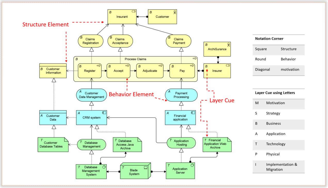
While ArchiMate models don’t prescribe formal semantics to colors, modelers have the flexibility to use them for layer differentiation. The ArchiMate Core Framework, for instance, leverages colors to distinguish between its layers. Business Layer elements are highlighted in yellow, Application Layer in blue, and Technology Layer in green. This color scheme serves as a powerful visual aid, simplifying the interpretation of complex models.
Visual Emphasis and Additional Cues:
Colors in ArchiMate models can go beyond layering; they can be employed for visual emphasis. Examples within the standard showcase the strategic use of colors to draw attention to specific aspects of the model, making it more intuitive for stakeholders.
In conjunction with colors, notational cues further enrich the modeling experience. Modelers can utilize letters such as M, S, B, A, T, P, or I in the top-left corner of an element to denote its Motivation, Strategy, Business, Application, Technology, Physical, or Implementation & Migration nature. This notational approach provides an at-a-glance understanding of the purpose of each element, aiding in quicker model comprehension.
Symbol Corner Shapes for Element Types:
The ArchiMate standard introduces a convention based on the shape of symbol corners to distinguish between element types. Square corners denote structure elements, round corners signify behavior elements, and diagonal corners are allocated for motivation elements. This additional notational cue adds another layer of clarity to the models, helping stakeholders identify element types with ease.
Conclusion:
The strategic use of colors and notational cues in ArchiMate models significantly contributes to the effectiveness of communication within the enterprise architecture domain. The standard’s guidance on shades of grey, layer-specific colors, and notational cues empowers modelers to create visually appealing and informative representations. As architects navigate the complexities of enterprise structures, leveraging these visual elements ensures that the models remain not only comprehensive but also accessible to a diverse audience.

Resources:
- Tips and Tricks Example: Why use different colors in ArchiMate? What does it means?
- Color Coding In ArchiMate
- ArchiMate – Muted Colour Scheme
- ArchiMate Resources for FREE – Visual Paradigm
- ArchiMate Diagram Tutorial
- TOGAF® Tool for Enterprise Architecture
- ArchiMate 101: A Practical Introduction
- Comprehensive Tutorial on ArchiMate
- ArchiMate – Wikipedia
- Understanding ArchiMate Key Concepts: A Comprehensive Guide
- Introduction: ArchiMate® 3.2 Specification